


Big changes for the Butterfly Club
The Turner Syndrome Society of Canada (TSSC) has long been a cornerstone of support, education, and advocacy for individuals affected by Turner Syndrome. However, as digital engagement and brand presence become increasingly vital, TSSC is in need of a refreshed identity to enhance visibility, professionalism, and community connection. By modernizing its outreach efforts and creating a cohesive visual identity, this rebrand aims to strengthen TSSC’s ability to attract new members, donors, and partnerships while reinforcing its role as a trusted and supportive organization.
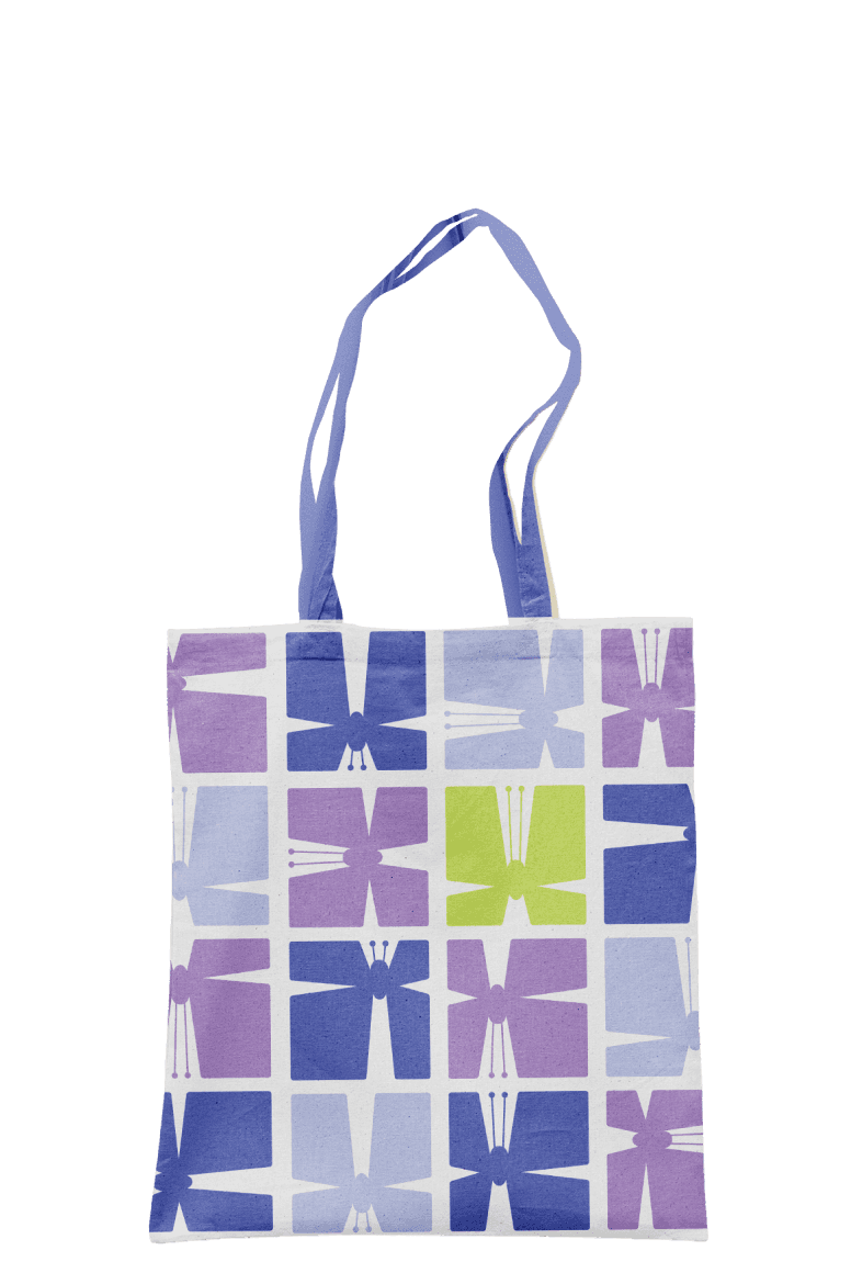
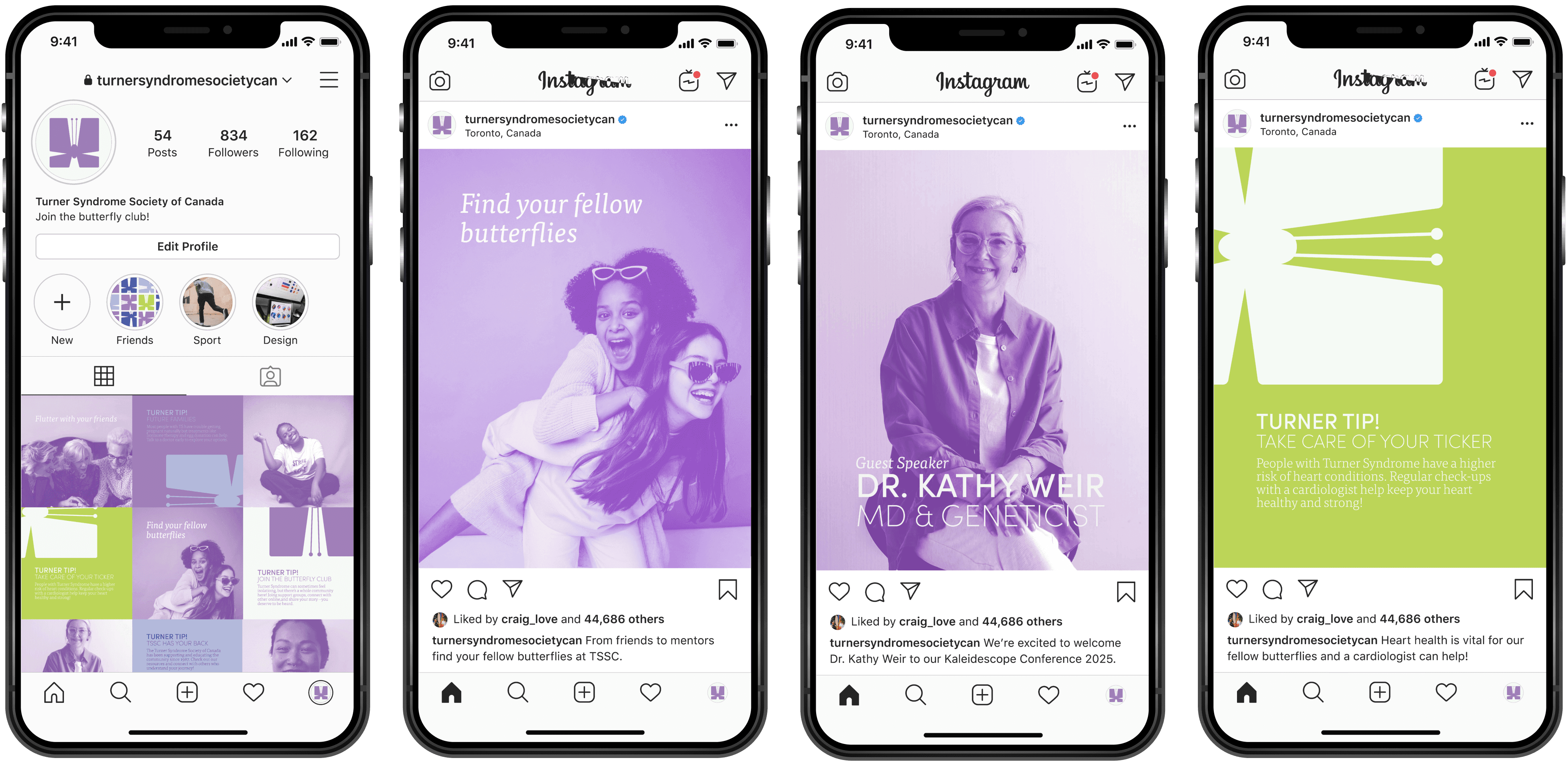
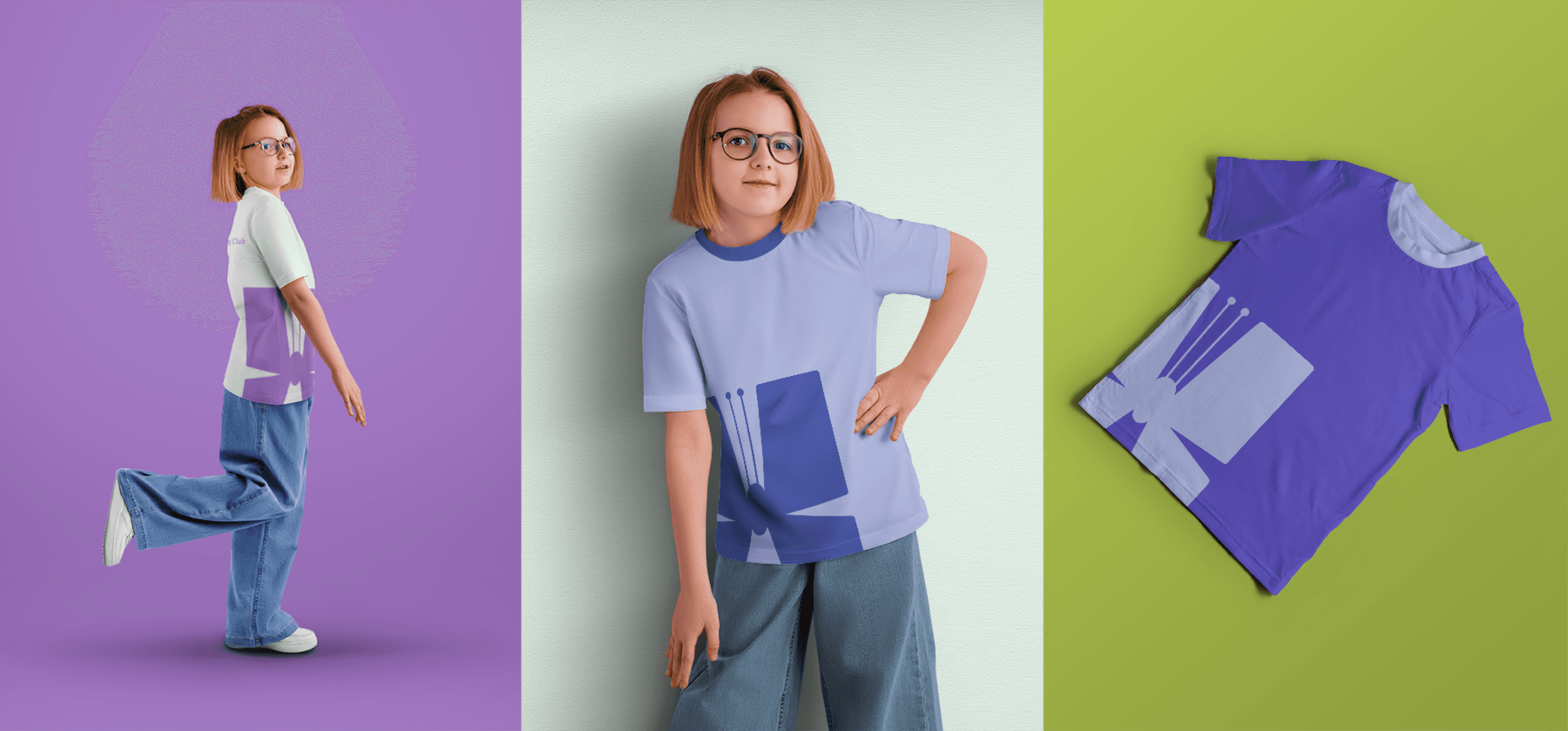
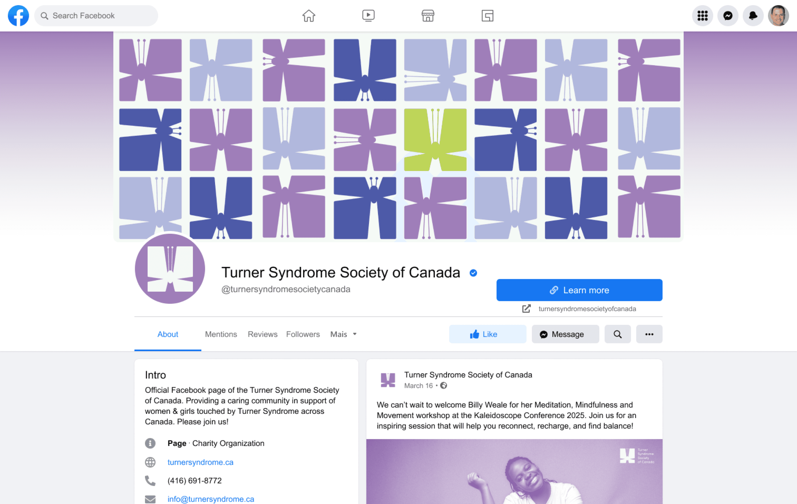
To expand its reach, the rebrand includes a revitalized presence on Instagram and Facebook, featuring customizable templates that make it easier for TSSC to create and share engaging content. A new line of merchandise will increase awareness and generate additional funding for the society. Additionally, the annual Kaleidoscope conference will feature an adaptable design system that can be refreshed with new colour palettes each year, ensuring the event remains visually exciting and consistent with TSSC’s evolving brand identity. These strategic design solutions will help TSSC grow its community, amplify its mission, and provide ongoing support to its members.
REBRAND / MARKETING CAMPAIGN
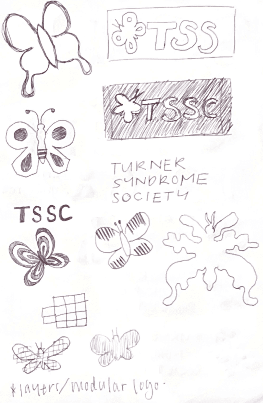
TSSC
Create a brand identity that respectfully and beautifully represents the Turner Syndrome Society.
This rebrand began with a commitment to empathy and usability. It was essential that the new identity felt approachable and empowering — not only to the public, but to the TSSC team members who would use it daily. The brand needed to function as both a tool and a symbol: easy to implement, yet meaningful enough to rally community pride and engagement.
Extensive research and a personal connection to the Society — through my aunt, who serves as TSSC’s president — provided me with invaluable insights into their values, goals, and day-to-day realities. This understanding helped shape a thoughtful strategy for shaping the brand.
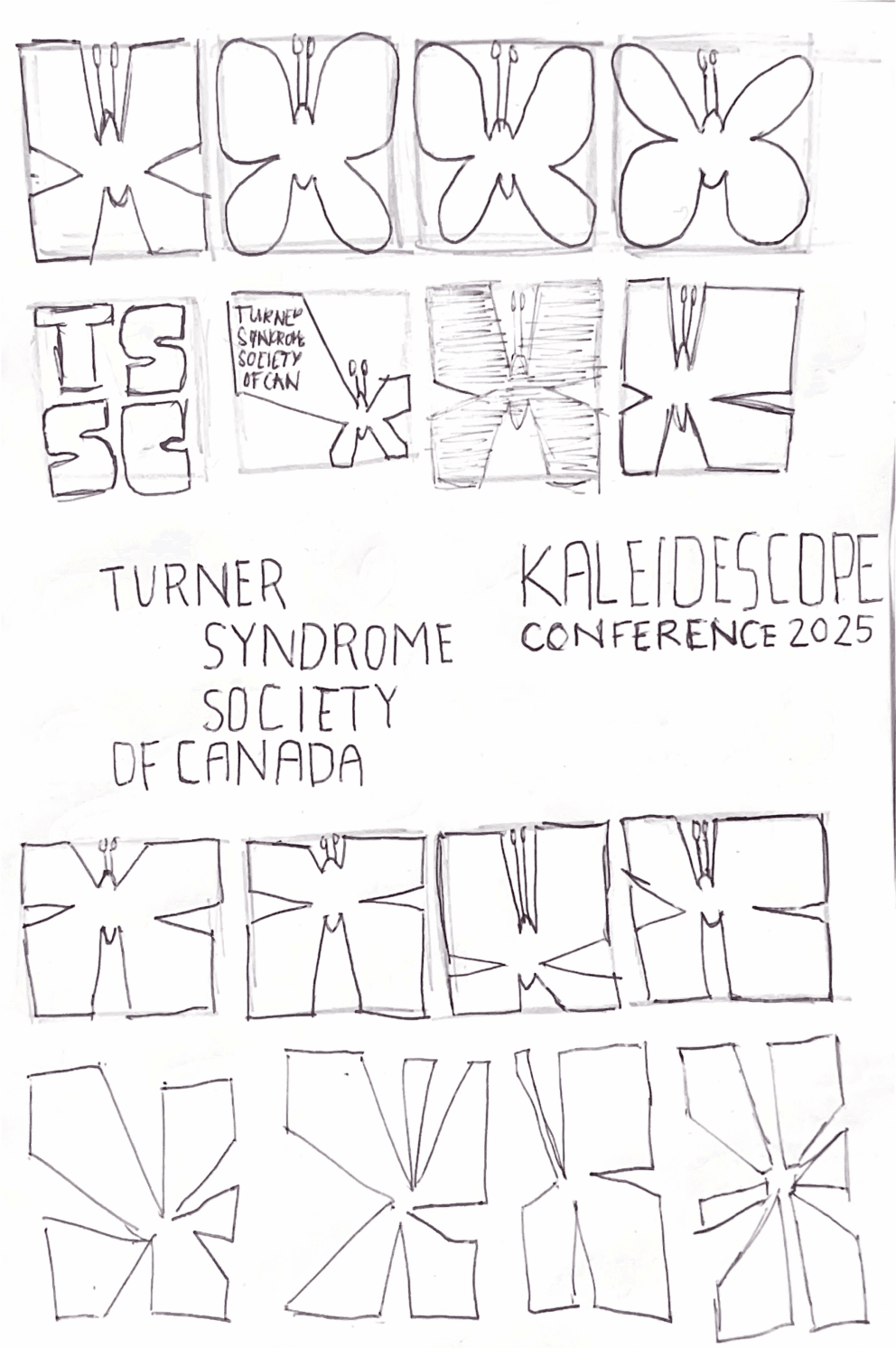
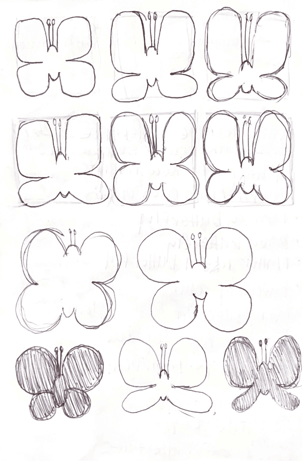
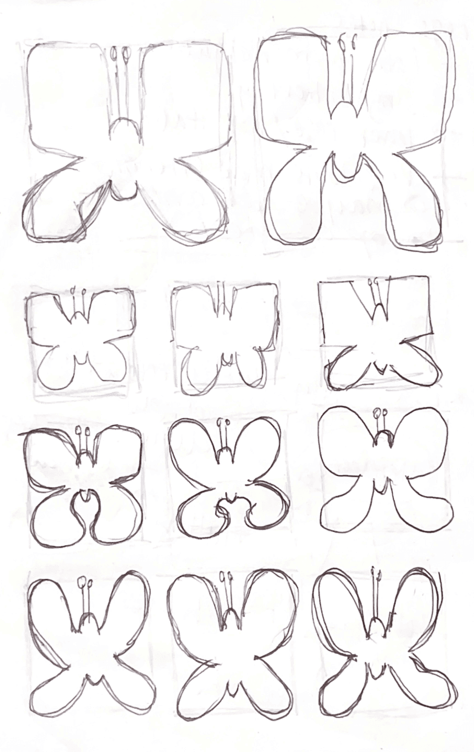
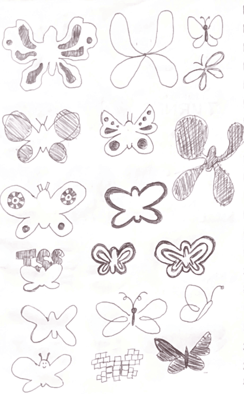
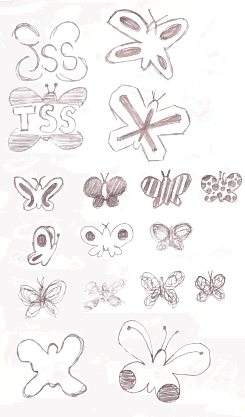
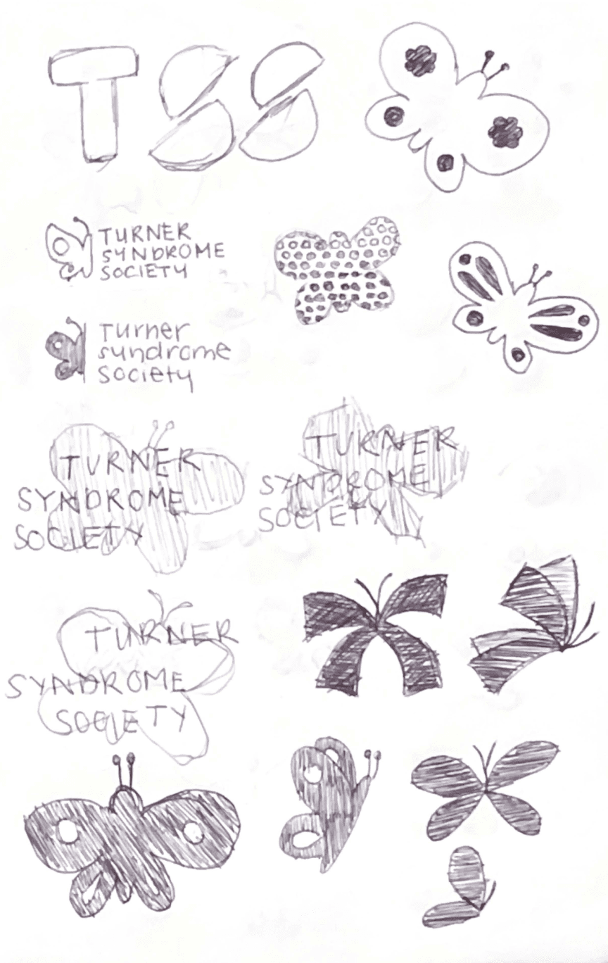
Because Turner Syndrome is a chromosomal condition — and chromosomes visually resemble butterflies — the butterfly has long served as a symbol of the syndrome. This rebrand aimed to evolve that emblem with care, honouring the past while building toward a more recognizable, cohesive presence across social media, merchandise, and TSSC’s flagship event: the Kaleidoscope conference.
A thoughtful visual identity system that modernizes the Society while staying rooted in warmth, clarity, and community.
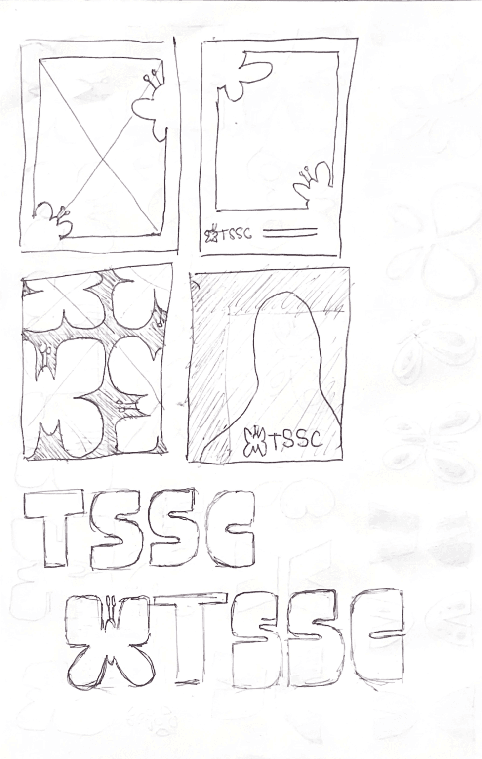
The redesigned logo refines the butterfly — a long-standing symbol of Turner Syndrome — into a clean, modern mark that is both meaningful and memorable. Its symmetry and softness reference the chromosomal origins of the symbol, while its simplicity ensures it can scale across digital, print, and merchandise without losing impact.
The expanded colour palette builds from the Society’s traditional purple, adding soft complementary hues and a bold pop of green to bring contrast, energy, and versatility. Typography was selected to be legible and friendly for a wide audience, with Sofia Pro for approachable, rounded headers and Tisa Pro for accessible, readable body copy.
Special attention was paid to the Kaleidoscope Conference, rebranded with a flexible system that can evolve each year while maintaining a cohesive look. A group of butterflies is called a kaleidoscope, making it the perfect metaphor for the annual gathering. Branded slogans like “Join the Butterfly Club” and “Flutter With Your Friends” help generate buzz while reinforcing community spirit, ensuring this refreshed identity could carry the Society confidently into its next chapter.


Key takeaways
This project was an incredible opportunity to design for a client deeply passionate about their mission. Incorporating feedback from board members and drawing inspiration from the Society’s archives helped me tailor solutions that were both thoughtful and strategic. It reinforced how essential it is to build strong, trusting relationships with clients — especially when working with sensitive and deeply personal subject matter.
The process also opened the door to a continued relationship with the Turner Syndrome Society of Canada. As their brand evolves and new needs emerge, I’m excited by the possibility of supporting their future design work and helping them grow their presence even further.